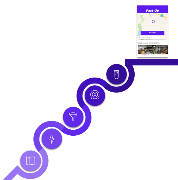
Post Up
A Design Spring Solution
For the remote workers of the world, finding a decent place to get work done on-the-go is often more stressful than the work itself.
Most mapping apps cater to the mainstream - work space quality is a niche concern and scouring through nearby options is a huge hassle.
I saw this as a great opportunity for a design sprint; I could test low-risk, low-cost solutions by exploring options without committing to them.
Herein you’ll find my week-long adventure in advancing the mobile prototype “Post Up.”
The Team
I condensed the roles of a UX team to one person (me) for a single player exercise.
Tools
XD, Invision
Tactics
Workflows, lightning demos, crazy 8's, storyboard, lo-fi mocks, hi-fi mocks, usability testing
Modifying the Design Sprint
A sprint is a 5-day experiment that evaluates key features without building a full product – designers can try out big ideas without buying into them. Since the process takes only a week, each day is a step of rapid progress.
A traditional sprint is team-oriented, containing some exercises to force quick decisions and streamline negotiation. Being alone, I had to adjust or omit some of these practices to get the most out of the exercise.
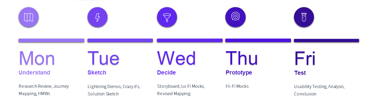
Day 1
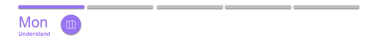
The goal of Day 1 was to get up to speed with the problem space, then narrow in on an opportunity with the most potential.
A real-world UX team might review research data from previous interviews, surveys, or UTs. For the exercise, I was provided interview clips, notes, and personas by an educational website, Bitesize.
Research Review
I wanted to fully understand the problem from the perspective of users. From the research, I extracted major frustrations of looking for a work space as well as the main criteria workers have for these places.

Work Space Criteria
Fast & free wi-fi
Outlets for charging
Plenty of space, not crowded, quiet
Close by
Private areas, conference rooms
Comfy Seating
Good Coffee/Food
Major Frustrations
Google Maps' "crowd estimates" are for food not seating
Have to search pictures/reviews for relevant info
Most pictures/reviews unhelpful, feature food not the space
Info not specific – has wi-fi, but good or bad?
Journey Mapping
A sprint is solution-focused so I flipped normal design methodology on its head and immediately considered the end-state of my product:
Best End-State (to set expectations): Quick, efficient, and accurate suggestions; users find ideal a work space they trust in a couple minutes.
Worst End-State (to frame setbacks): Suggestions don’t capture the user's need; not well organized, not sensible to users; info is outdated – inaccurate and unreliable; photos or reviews don’t capture the right content
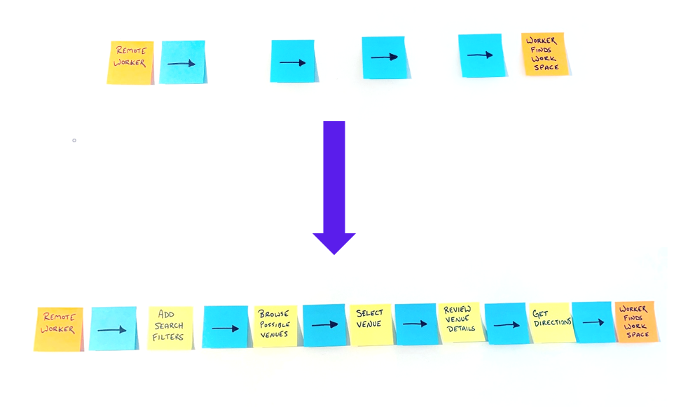
I wanted to flesh out the steps critical to a user’s journey. With the finish line in mind, I considered the experience at the beginning. Who were my users and what was their entry point? I added a beginning-state and end-state as left and right limits to a user's journey, then filled in the gaps.
How Might We’s
I wanted to hone in on the step of the user’s journey with the most opportunity for improvement. Given the user research and worst/best-case scenarios, I theorized “How Might We…” questions that exposed major areas of the experience a new design could improve.
How might we…
…Evaluate quality work spaces with criteria valuable to users?
…Estimate work space availability in real time?
…Suggest work spaces organized to user’s needs?
…Encourage user engagement and feedback?
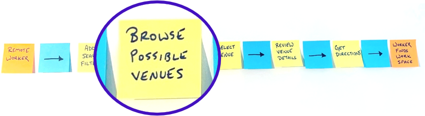
I then applied the HMW to each step of the map and picked the step I thought was critical to the most questions. Browsing possible venues appeared to be the crux of a user’s journey to me.
Day 2
The step of the user experience my sprint was decided – browsing work spaces. While Day 1 was all about understanding the problem, Day 2 would start to imagine possible solutions.
Lightning Demos
To keep the ideas flowing, I lightning demoed competitor solutions. I spent only 15 to 20 minutes on each competitor - moving through screens quickly, taking brief notes and some screen shots.
Since my design solution would help users evaluate spaces, I looked into Airbnb and VRBO.
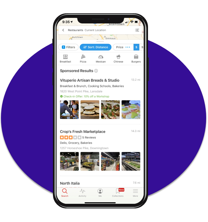
I then looked to the giants of location-based services, Google Maps and Yelp.
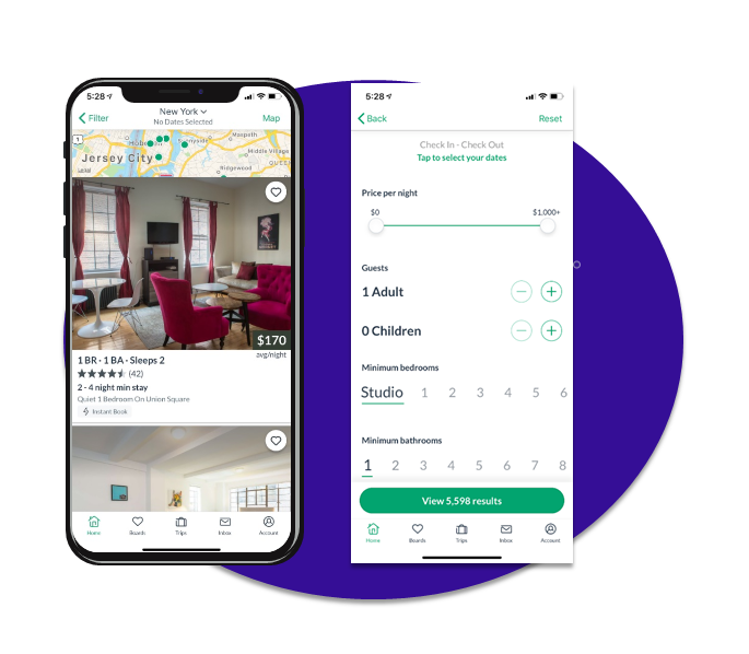
VRBO
A platform for finding vacation home rentals, VRBO showcases rooms and spaces.
Small map at the top
Single, large picture
Preferences on a separate screen
Icons for amenities
Sliders, scales, and buttons
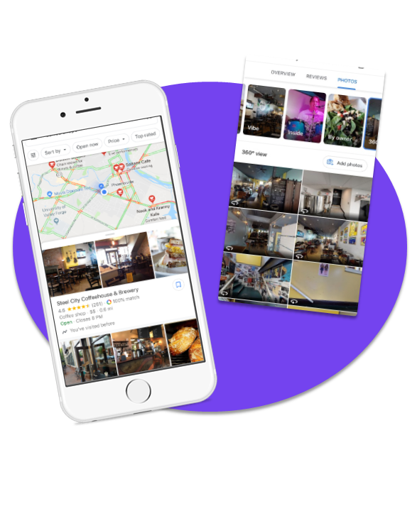
Google Maps
The go-to cross-platform solution to finding anything anywhere. Well-polished, though generalist option for finding a work space nearby.
Offers busy times and graphs
Quick filter toggles
Categorized photos, “360, Vibe, Inside”
Map at the top, then listings
Overview, menu, reviews, photos
Yelp
Service and venue finder that leverages options, toggles, and filters to stay competitive as it cannot offer GPS navigation itself.
Map at the top
Expandable filter menu
“Features” listings, visual cues
Recommendations
Searchable reviews
Icon toggles, drop-down filters
Crazy 8's
With the foundation of Monday’s research and today’s demos, I was ready to brainstorm possible solutions. I rapidly sketched designs in a round of Crazy 8’s - a total of eight designs, one per minute. This kept the sketches focused, forcing me to think of small changes.
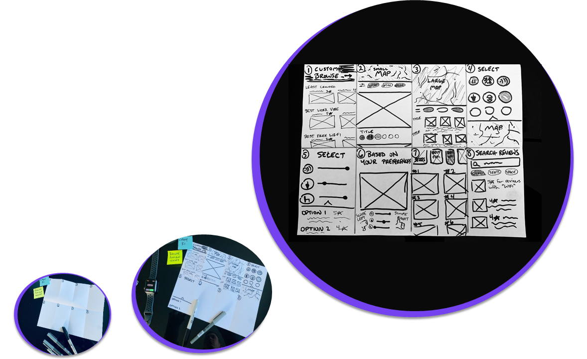
Recommendations
Single, Big Picture
Large Map
Filter icons / Map
Filter scales / Listings
Swipe right
Picture Listings
Search Reviews
Solution Sketches
I needed to synthesize the best ideas from the Crazy 8’s into one coherent solution.
I chose Design 2 as the main inspiration for my solution. It was inspired by clever features in VBRO and Yelp - a single, panoramic picture great for viewing spaces and helpful icon-filters for easy sorting - all great for work space browsing.
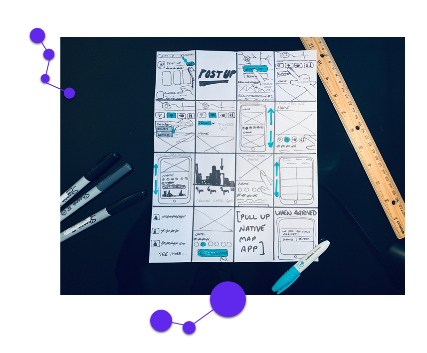
I sketched out the solution design by hand (middle). For context, I then sketched the screens that would come before and after in the user experience (left and right).
Day 3
Normally, the design team would vote and choose the best solution sketch on Day 3 (each member having drawn their own). Since I was alone, I blew out my own sketch into a storyboard to find flaws or inconsistencies.
Storyboarding
I sketched the user’s journey start to finish with heavy emphasis on user actions. By seeing the journey as a comic strip narrative, I could easily spot shortcomings in interactions within the context of the big picture.
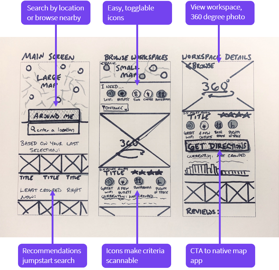
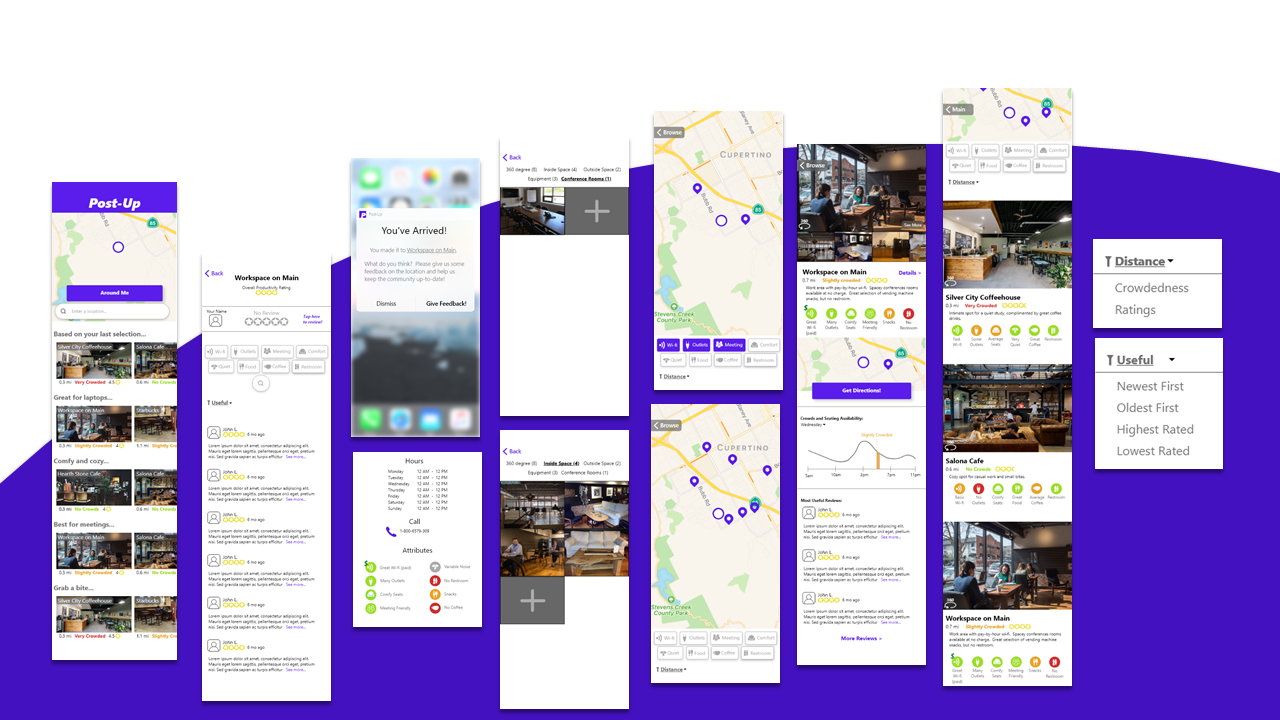
Lo-Fi Mocks
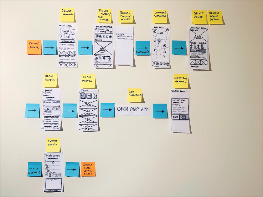
From the insights of the storyboard, I revisited my solution sketches and created more mock-ups that would support a user’s journey.
I related the mock-ups to the storyboard but also to the mapping from Day 1. To tie things together I filled in the steps from Day 1 with these new screens.
Day 4
I now had a rough idea of what the screens would look like and how everything fit together. In Day 4, I would create a polished prototype for the most realistic user testing.
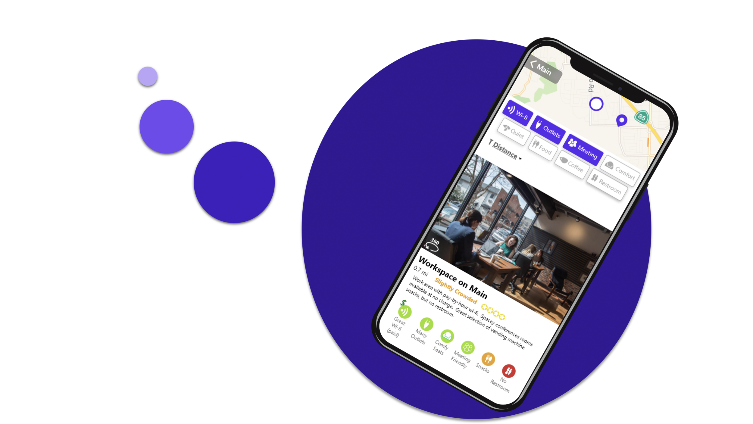
Hi-Fi Mocks
Since I had only one day, I started with the screens in my solution sketch. These were the heart of the testing so I wanted to invest as much time in them as necessary.
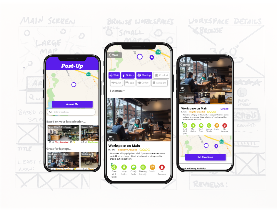
With the remaining time, I built out auxiliary screens and utilities that would support the testing
Research Questions
In comparing my HMWs from Day 1 to the core design features and hi-fi mocks, I decided on a few essential motifs to guide my testing:
How do users interact with the showcase photos?
How well do color-codes & icons communicate?
Which toggles/filters are most useful and why?
How do the users feel about the content layout in comparing places?
Day 5
With the prototypes loaded to InVision, it was time to get user insight on Day 5!
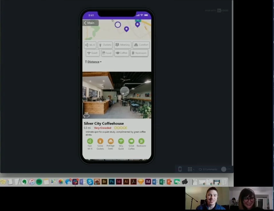
Usability Testing
I recruited five participants, screening them to make sure they had experience working remotely. One of the tests was done in-person the others were done remotely (via Skype).
Users were prompted with four scenarios encouraging them to explore key features of the app and to find a work space. Each test was recorded - afterwards I reviewed the footage and took detailed notes on the interactions.
Cross-Sectional Analysis
To clearly visualize strengths and weaknesses in terms of my goals, I charted the four research questions together with each of the participants and filled in the grid with relevant observations.
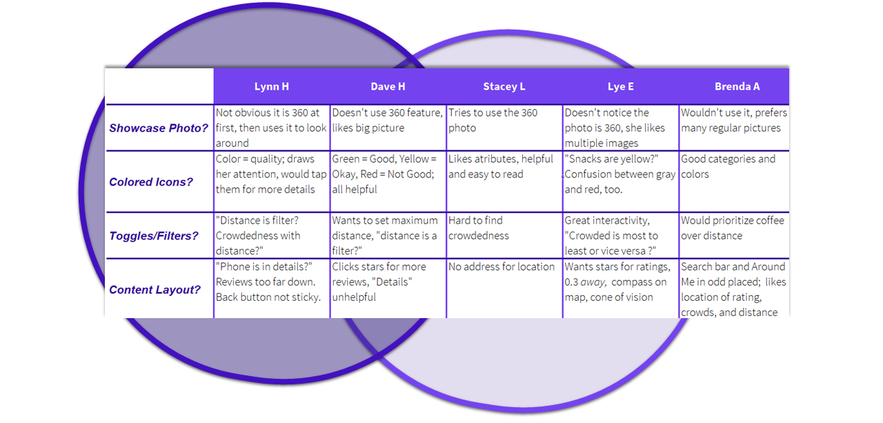
Major Discoveries
Filters/Toggles - strong approval, but revise/improve drop-down menu
Color-Coded Icons - strong approval, but refine categories and organization
360 Showcase Photos - Mixed opinions, liked large photo, 360 unnecessary
Content Layout - items missing or need rearranged (address, compass, cone of vision, search bar & button, phone number, reviews)
Recommendations - unused, unwanted, make browsing the first screen
Design Sprint Complete!
Small Buy-In, Big Pay-Off. By inventing a few concepts and testing quickly, I gained possible solutions, insights for improvements, and user opinions on content, style, copy, iconography, and architecture.
Lessons Learned
Test Casually
Be conversational; don’t ask stilted questions -participants will feel at ease and be authentic
Invest time in main screens
Most users didn’t use peripheral screens, prototyping that would be better spent on main features
Be bold, take risks
Users didn’t like the 360 screens, but through them I learned what users did like; sprints are low-cost so think big
A sketch isn’t final
My sketches were sometimes sloppy but I generated a wealth of options by not over-analyzing them