Concha Labs
Innovative Testing in Design Interaction
Those with hearing impairments spend thousands on doctors and devices. Concha Labs aspires to use machine learning to cut out the middleman and offer a personalized, low-cost alternative to traditional hearing aids.
An online sound profiler, which tests a user‘s hearing, is the engine behind Concha Lab‘s innovation. Clean and easy UI is critical to the accuracy of online testing and the the overall success of the company.
Towards this end, I worked alongside the CTO as the company‘s first UX designer to identify opportunities for the profiler and optimize the user experience.
The Team
Drew Hopkins (Me) - Content Strategist, Visual/Interaction Designer
Mark Sorg (CTO) - Product Management
Tools
XD, Google Survey
Tactics
UX auditing, material design, hi-fi mocks, A/B preference testing
Understanding the Problem
Concha Labs was working towards many goals simultaneously. The mechanics of the sound profiler were complete, but the company was still between many ideas for the UI of the product.
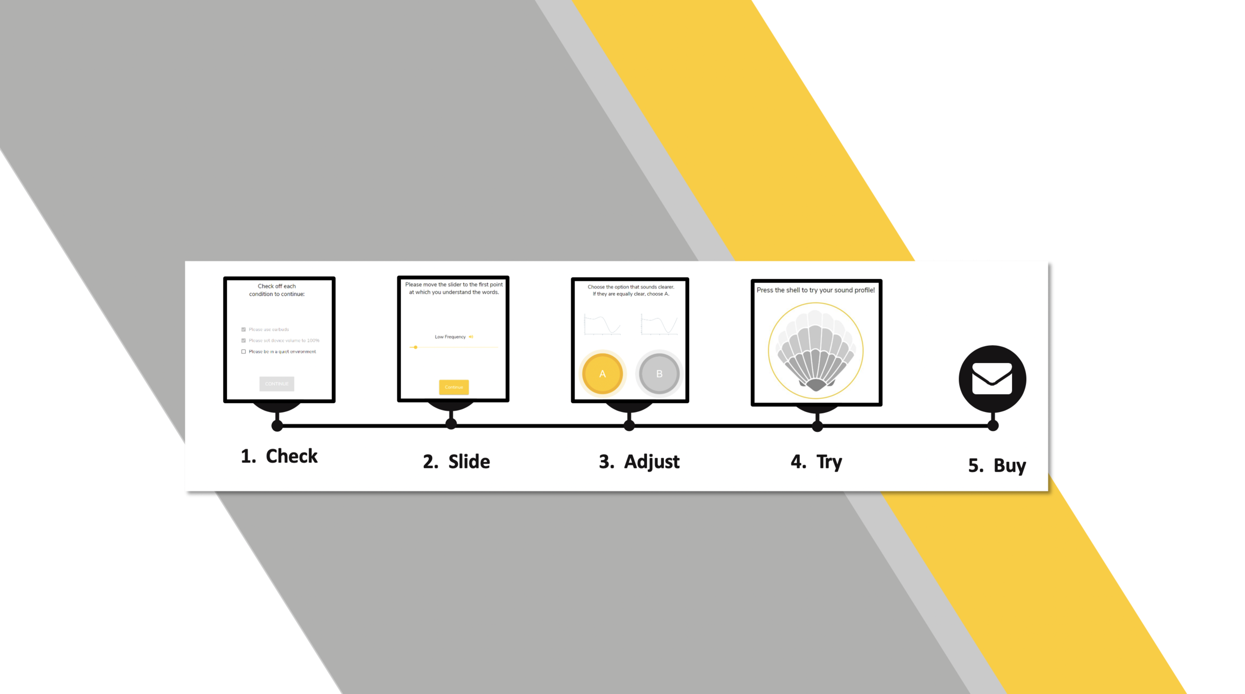
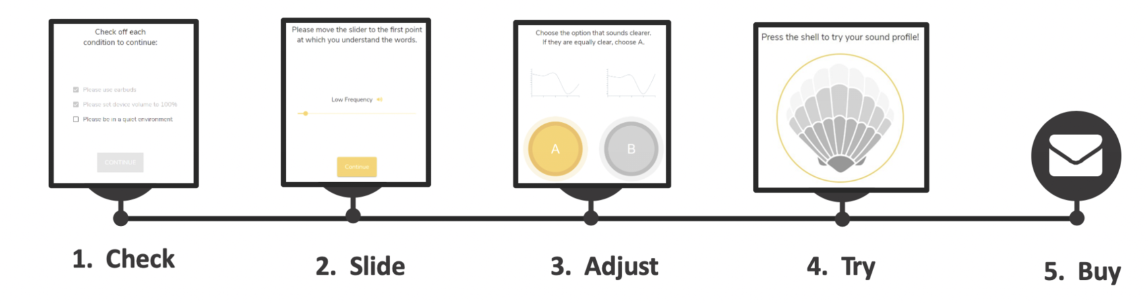
Here’s the basic steps of how it worked:
Check - users set up for profiling
Slide - users select the lowest volume for several frequencies
Adjust - users chose the clearer of two frequencies in a series of tests
Try - users can sample an audio file filtered through their profile
Buy - users can purchase a hearing aid augmented by their profile
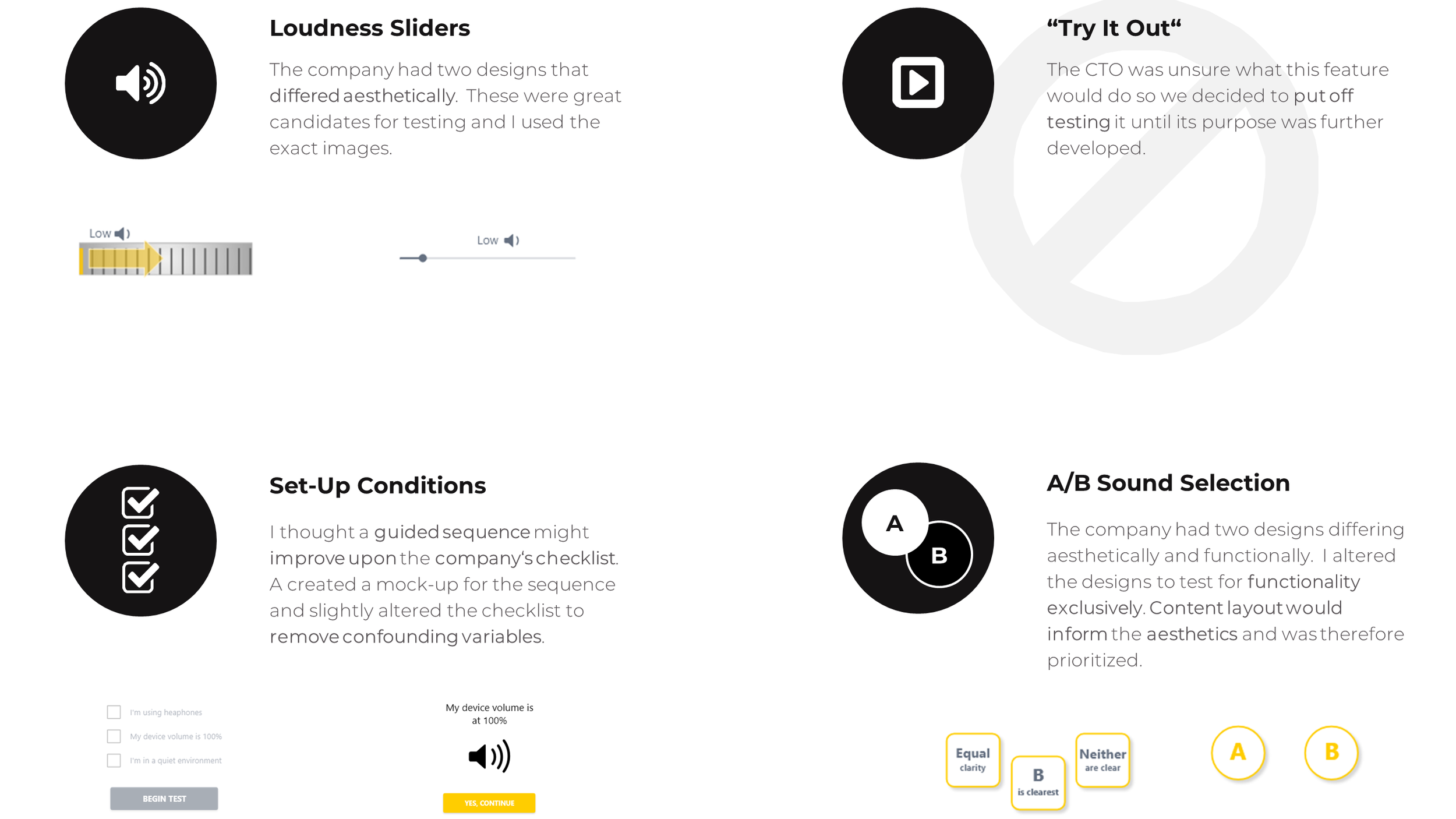
I consulted the CTO to distill up-front which steps of the app were priorities. I found out the company already had alternative designs for the Slide and Adjust steps so these were good prospects for testing. There were several concepts in the works for the Try and Buy Steps so designing screens and testing them was a possibility as well.
Before committing to a plan of attack, I asked the CTO for time to familiarize myself with the product.
UX Audit
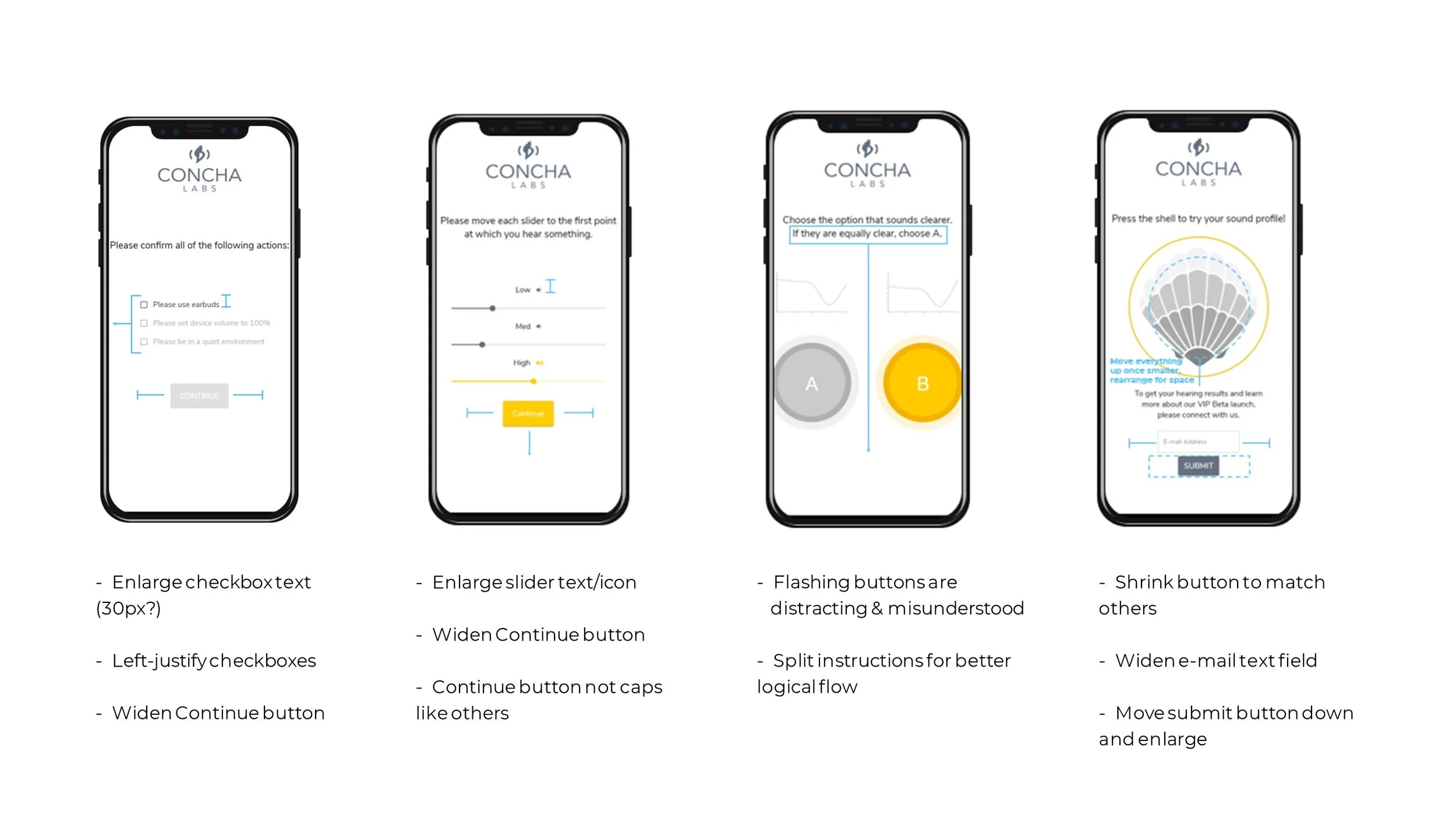
I test ran the Beta several times, looking for inconsistencies and potential pain-points. Afterwards, I summarized my findings in a guideline. I marked up existing screens with highlights and annotations so that the CTO and I could visualize our options together.
Impressions
The Beta featured a modern design with impressive visual effects and animations.
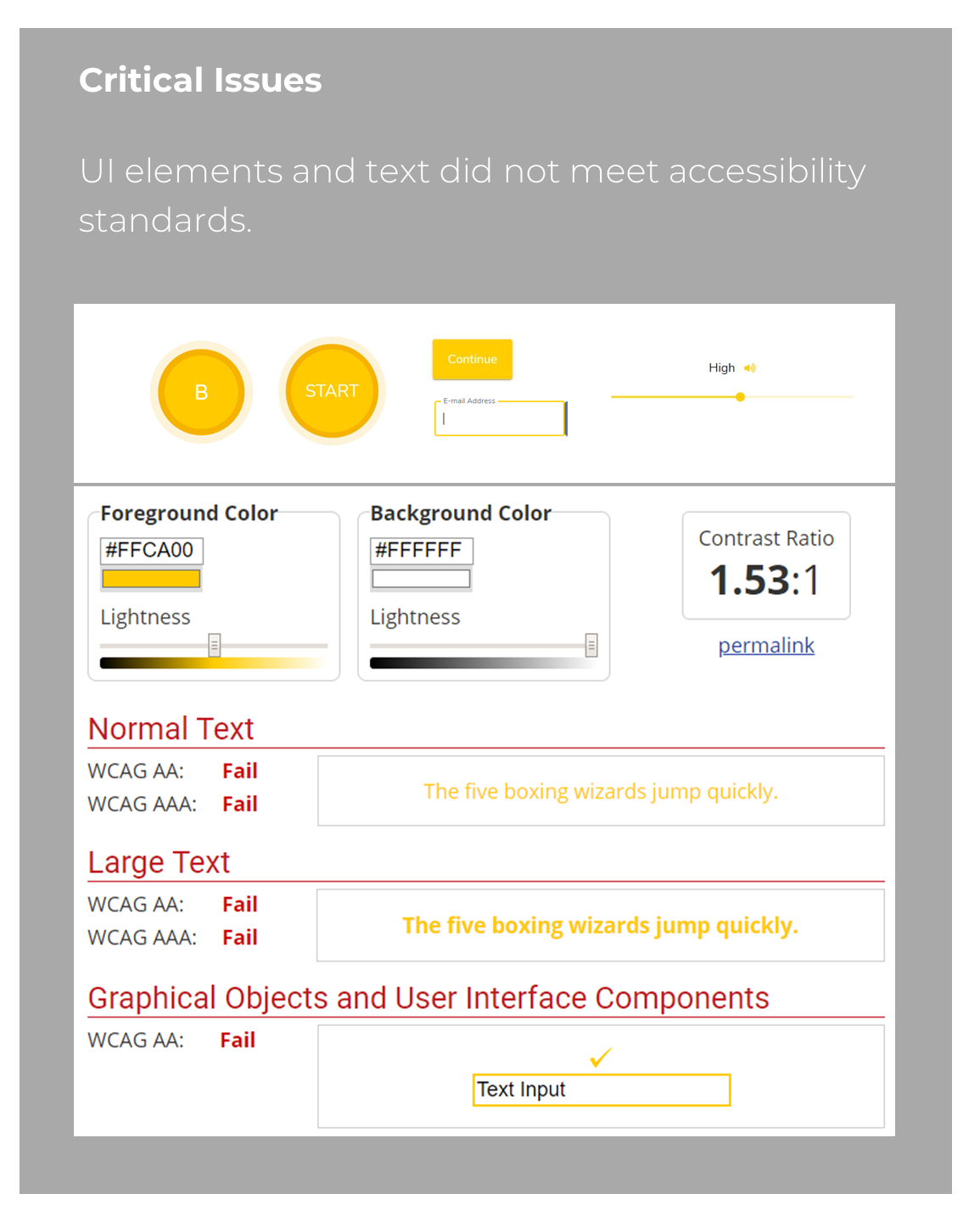
One major concern for the app was contrast. Most of the text and GUI elements fell short of industry standards. This could lead to serious implications for the company.
I saw potential benefits from a few other holistic changes - keeping button sizes and styling consistent, arranging the UI to maximize available space, and enlarging most text and buttons.
Building a Strategy
With a clear understanding of the product, I could now consider next steps.
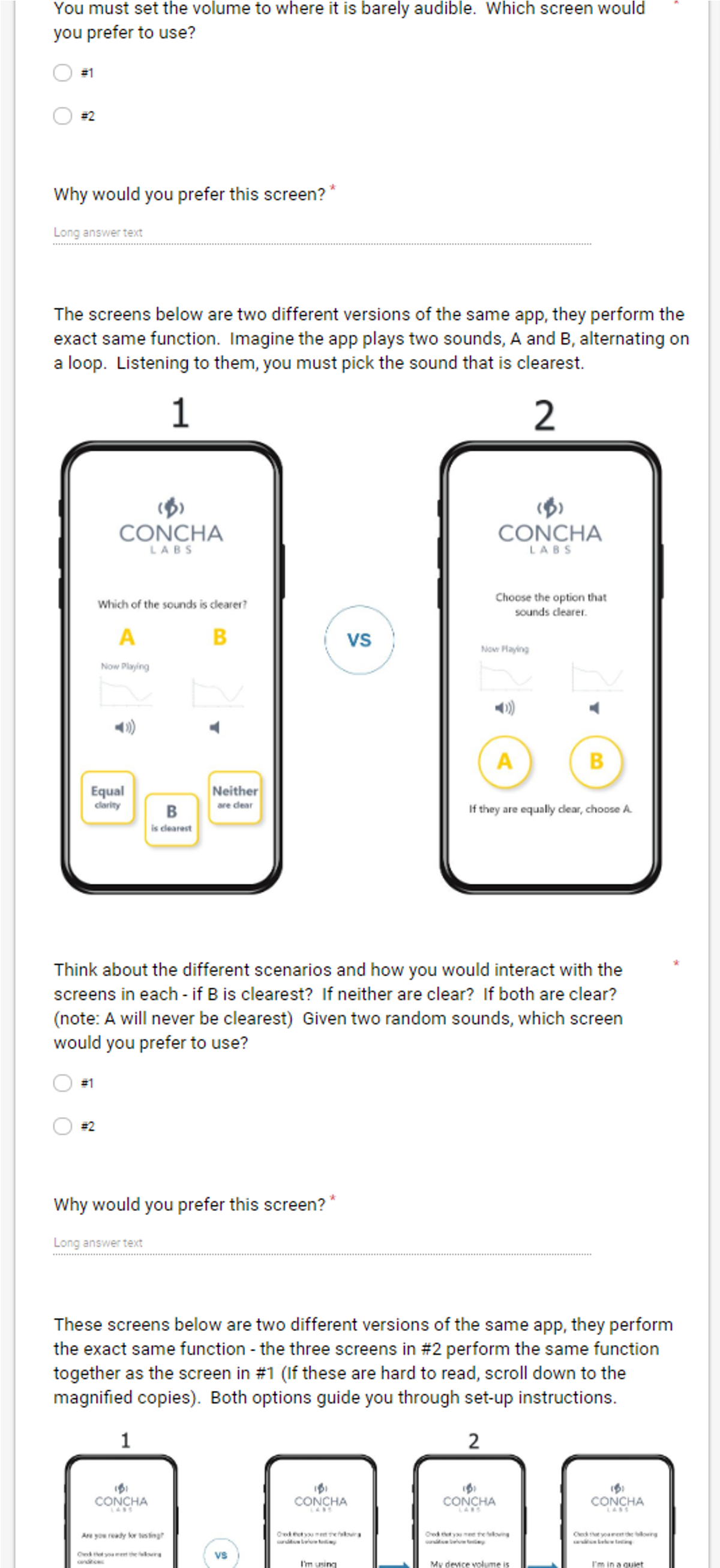
The company was conflicted on different versions of the product so getting user perspective on side-by-side comparisons would be a huge benefit. I thought to test 3 or 4 sets of screens like this at once. That way I could glean multiple insights at once and it wouldn't be so many as to overwhelm volunteers.
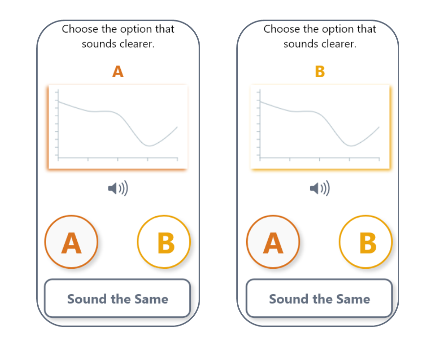
The most controversial component was the A/B sound selection. The CTO was concerned with the aesthetics and the functional clarity the screen which flashed two options, A and B, and asked users to decide between them. I created my own version of these screens for testing and decided to test the functionality exclusively for clean results.
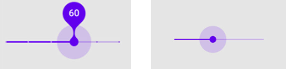
The loudness sliders were another great candidate since the company already had two designs of these they were between, a modern slider and a dial.
The CTO said there had originally been three sliders on one screen but in testing participants had become confused by them so the sliders were now spread across three separate screens. Following that logic, I proposed an alternative design to the set-up conditions. A set of three check-boxes might overwhelm users so I created a guided sequence that was more immersive.
Prepare for Testing!
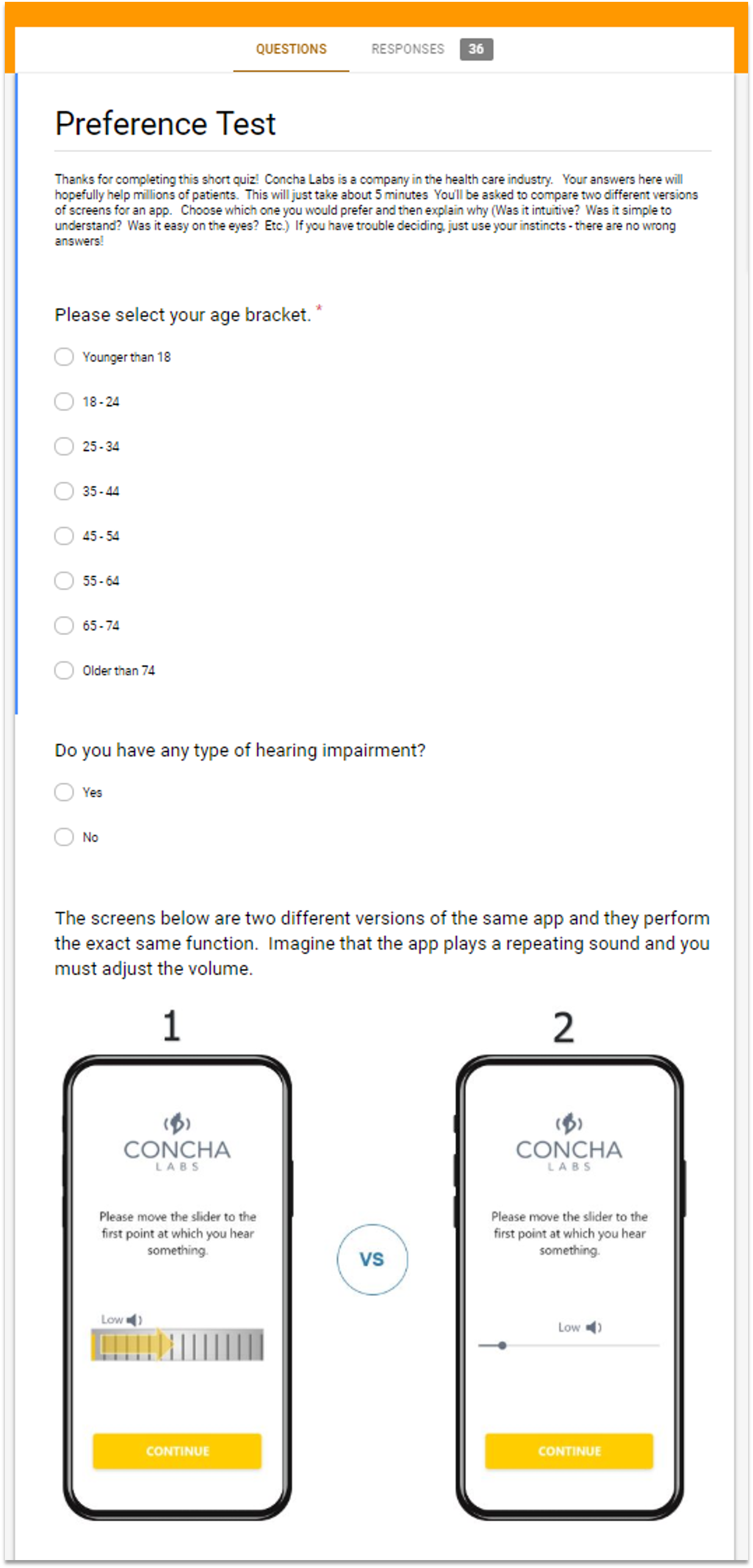
I decided a google survey would be an extremely efficient means of testing lots of people quickly.
I attempted to gather data from various age-brackets. The CTO expressed there might be future variations of the app to support elderly users so I wanted to identify any age-specific patterns.
Participants were also asked if they had any issues hearing. Ideally this would be a strict requirement, but the budget for recruitment was very tight. Since the tests were visual comparisons and this was an early prototype, I believed we would still gain meaningful insight without limiting participants to those with hearing loss. That said, it was an important data point to track.
Dissection & Analysis
Fast forward a few days and I had recruited 35 participants to take the online survey. Once the testing was complete, I organized each set of data by age and preference.
I mined the responses for common themes and recurring phrases. These I consolidated into key summary points and referenced when interpreting the statistics. I also did a statistical breakdown of the preferences by age and compared these to the average for anomalies.
After thoroughly reviewing the data, I provided recommendations for improvements and future research.
Test #1 - Slider Components
Results
Users favored Design 2 (modern slider) over Design 1 (the dial). They felt it was more comfortable, familiar and simple to use.
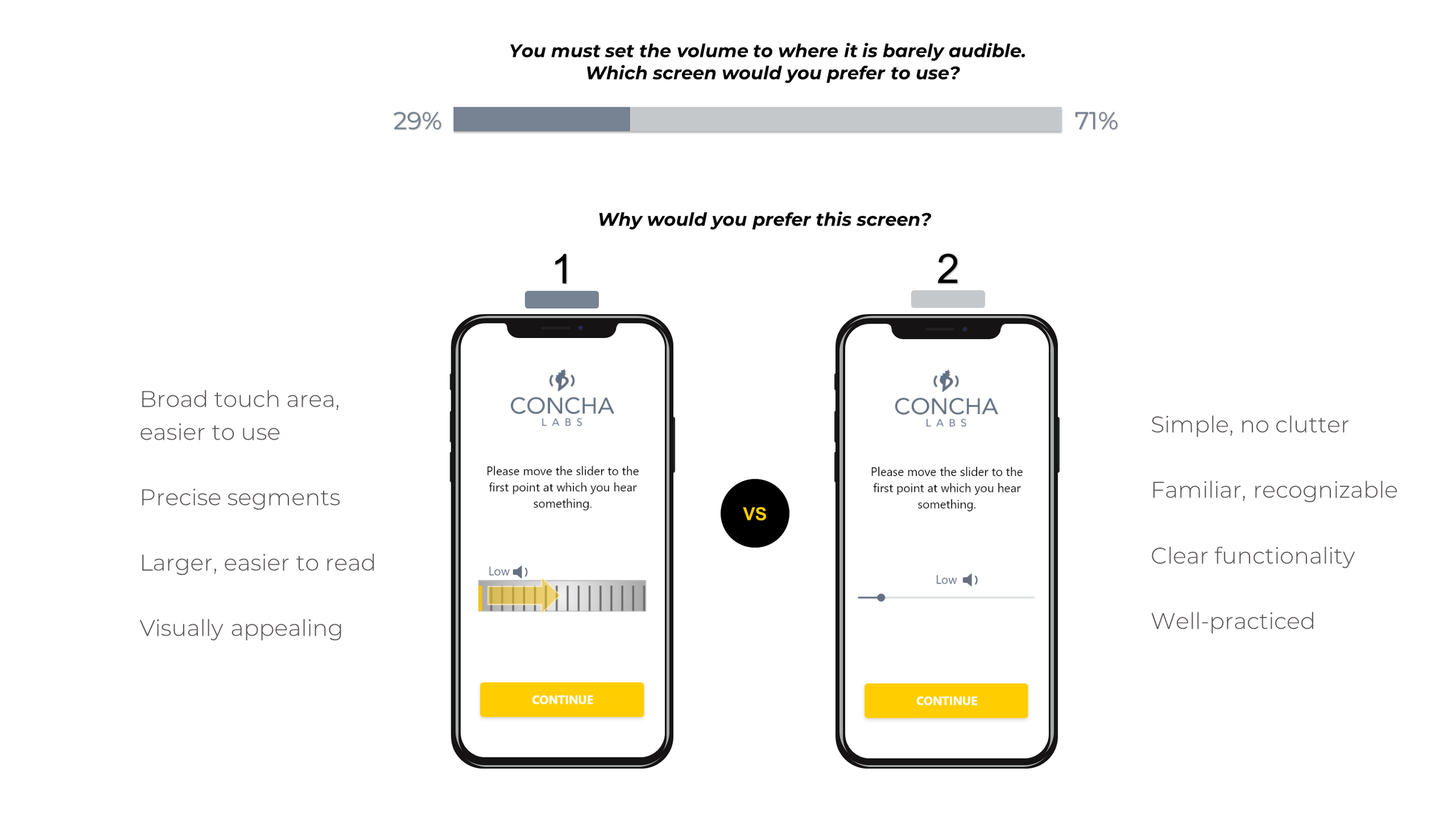
Recommendations
Beneficial features of Design 1 could be used to optimize the more popular Design 2:
enlarging the slider
adding segments
I recommended several other material design options that offered the benefits of a larger, precise slider while maintaining a sleek design.
Future Research
Older users appeared to like Design 1, but the sample size was too small to know with certainty. More demographic-specific data would be needed to validate the trend.
If the company follows through on its plans for alternative versions of the app, this would be a great avenue for investigation.
In the meantime, elderly users would strongly benefit from the changes suggested for Design 2.
Breakdown by Age
Test #2 - Sound Selection
Results
Users appeared to favor Design 2 (A / B buttons) over Design 1 (3-buttons), but the responses revealed many were conflicted or desired an alternative approach.
11% didn't like either design
Both screens complicated or not clear to
Majority liked Design 2, except for “if equally clear..." instruction
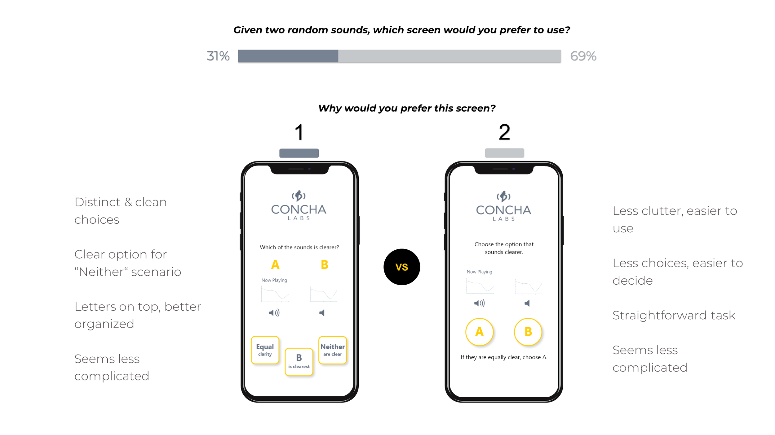
Recommendations
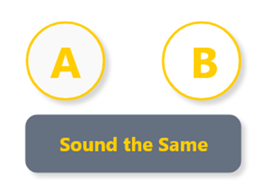
I suggested editing Design 2 to include a “Sounds the Same" button. This option is intuitive when sounds are equally clear and unclear, thereby accomplishing the functional clarity of Design 1 with the visual simplicity of Design 2.
Future Research
Shift focus to aesthetics - distinguishing A and B
Colors
Pop-out graph
Colored highlight
Separate screens
Horn icon / “Now Playing"
There were no clear age-related trends to pursue for future testing.
Test #3 - Setup Conditions
Results
Users favored Design 1 (check-boxes) over Design 2 (the sequence). However, their reasonings were controversial.
Design 1 perceived as faster, but could be hurried
Design 2 forced users to take conditions seriously
Some didn't recognize check-boxes in Design 1, saw bullets
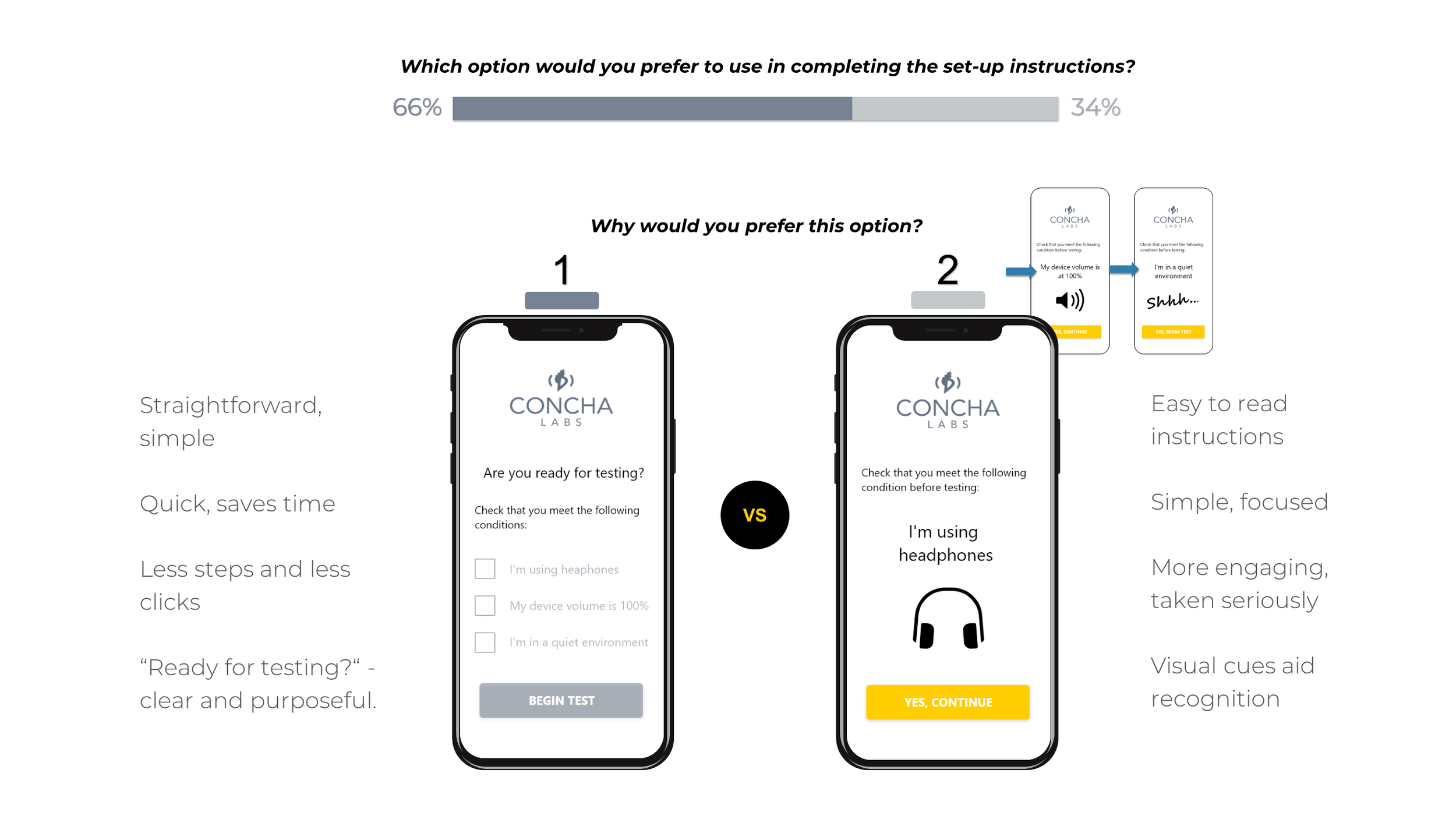
Recommendations
Users favored speed, but hastily rushing through the preconditions might spoil the profiler and ruin business prospects. The interaction was more complicated than expected.
I recommended further research to best advocate one design over the other.
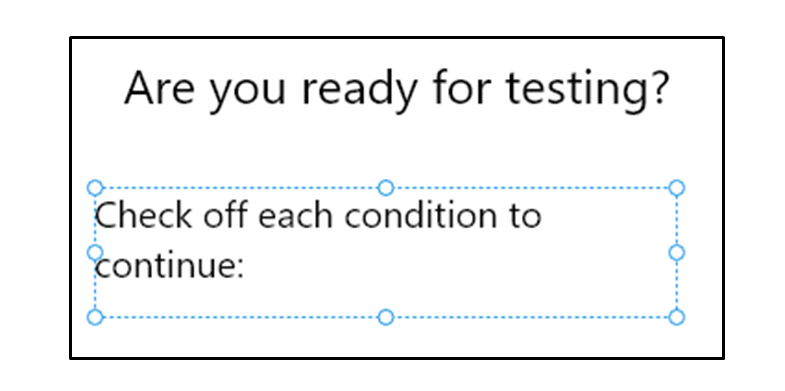
Meanwhile, the copy of Design 2 should be corrected to explicitly indicate there are check-boxes (see left).
Future Research
What users say they will do may not be what they actually do
Need to compare real-time user experience
Usability testing – time users for speed, evaluate thoroughness, gauge satisfaction
Bringing It Together
The preference tests were greatly successful. In the end I was able to supply Concha Labs with many benefits within just a short period of time:
Actionable critique of overall design
Confidence in / Improvements for the slider component
New data-grounded solution for sound selection
Business critical Insight on setup conditions
Multiple Avenues for Future Research
Lessons Learned
Divide and conquer when necessary
The content strategy and aesthetics of the sound selection were interdependent. By focusing on the more critical component (content) I made a major insight and set a solid foundation for future testing.
Eliminate all confounding variables
I tweaked content and copy to isolate the components being tested, but responses indicated slight variations in phrasing affected one or two votes for the sound selection and setup conditions.
Take time to understand, gain time later
By fully exploring the problem space and identifying the company‘s essential needs, I was able to triple up on testing and make progress on three key features at once.